My documentary |
|
4/27/2017 0 Comments Double page spread - 2nd draft
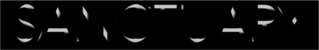
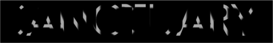
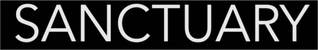
For our double page spread, we changed a few things to improve it's professionalism. We only changed the right side of the double page spread as this would be where people would look at the most to read about our documentary. The main and most obvious thing we changed is the style of the page, I removed the border as this made it look quite unauthentic and tacky, I also changed the font to PT Serif on Photoshop which gave a legitimate look as the font we had before made it appear rushed. I also enlarged the first letter of each new paragraph, which is something that many newspapers and magazines do, then finally, we didn't want to leave the page blank with only writing as this would make any viewer uninterested, so I added a giant letter S, we chose this letter because it is the first letter of the title of our documentary, I ensured the top and bottom of the S was in line with the top and bottom of the small print and this fit it well in the centre of the page, we also chose the colour of the S specifically, I used the eyedropper tool to get the colour of the kennel bars and made it that colour to relate both the pages together, however, when changing the opacity so the writing underneath was still visible, we lost some of the depth of colour, although this isn't ideal, we still think it shows the right colour. We got inspiration for this new design from a magazine double page spread about a celebrity.
 All editing was done on Photoshop.
0 Comments
4/27/2017 0 Comments Documentary draft 2We changed one thing in our documentary to improve it's overall quality. What we changed was the distance from one of the people we interviewed, Liza, we thought that the camera (therefore the audience) was too far away from her, this would have a negative effect because the viewer could get distracted by her surroundings. We still used iMovie for this edit and use the Ken Burns tool, this would allow us to zoom in slowly on the clip and stay there for as long as we needed it to.
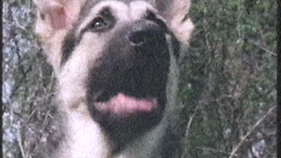
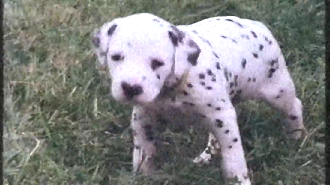
All editing was done on iMovie. 4/5/2017 0 Comments The process of the documentaryIntro/beginning:We wanted to have an introduction to our documentary including a series of clips of both archive footage and our own from the locations we visited, we also wanted to have a title that stood out and had an interesting transition in. We found an old Barbara Woodhouse documentary about dogs and used some of the clips in our intro and throughout the documentary.
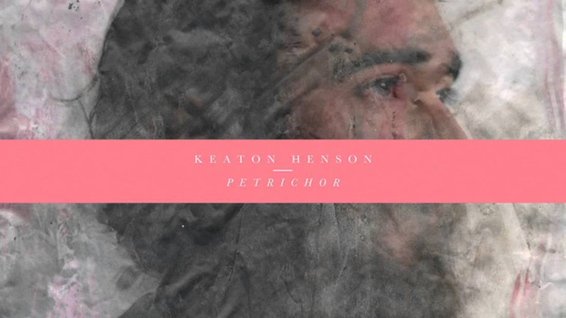
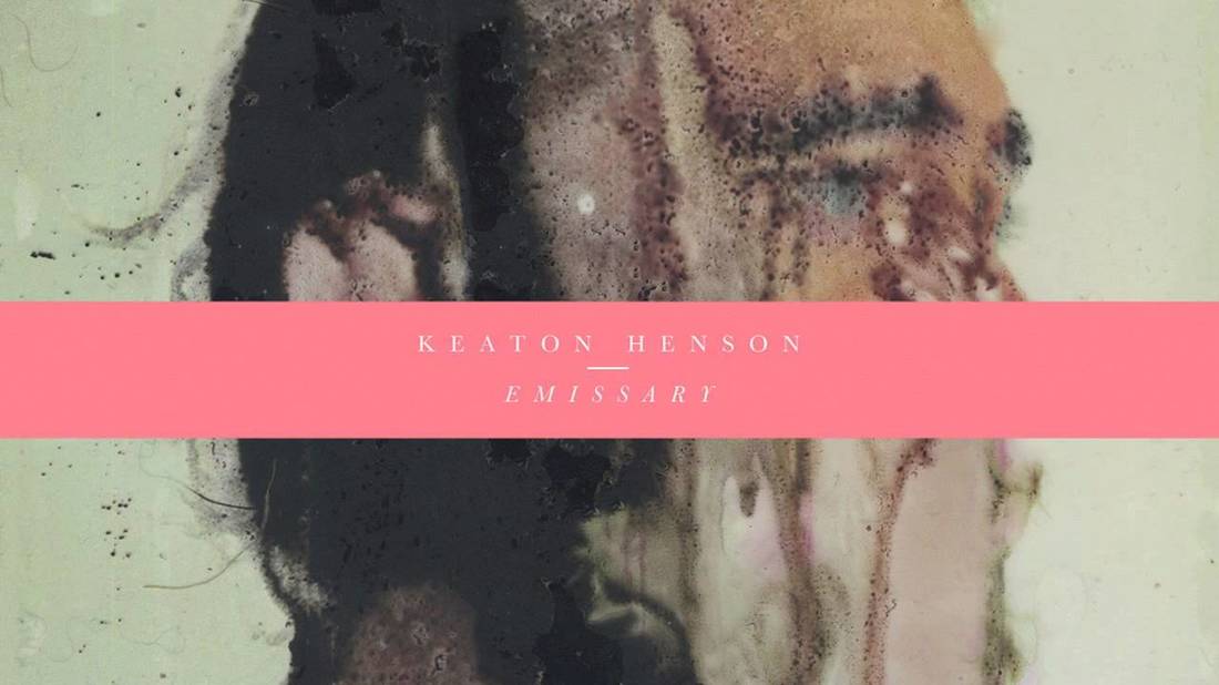
We decided to use the transition 'Prism' from iMovie on the entrance of the title, this was simple yet interesting and we think it relates to the documentary topic because it appears as bars (like a kennel) creating a word, which we like a lot. We used the same font at the end of the documentary stating 'End of Part 1', by using the prism transition we have related the beginning and the end of the documentary together. The music we aimed to find we wanted to be subtle yet effective when put with the footage, we both liked the thought of a piano playing along with the interview audio and clips of the interviews and additional clips. We wanted the atmosphere of the documentary to be emotive to the audience, I found a track called Petrichor by Keaton Henson which gave the right emotions for our documentary. However, once nearing the end of the editing process we realised the documentary seemed too much like a promotional video by having the same track the whole way through, so we searched for another track and we found To Build A Home by The Cinematic Orchestra, we used the instrumental version of this song for the introduction of our documentary which gave a good effect which we then faded into Petrichor when the title appears, however, this song is a bit too well known to play multiple times throughout the documentary, so we have decided to remove it completely, because if it is played right at the beginning it might give the wrong impression to audiences. As we were back to one track throughout the documentary we needed another track to have somewhere in the documentary, we then listened to more compositions by Keaton Henson and found Emissary which is also piano and gives a lower emotion, we are going to try and put each piece by Henson into our documentary carefully to match what the interviewees are talking about, so when they talk about quite sad things, we will use Emissary, when they start to talk about things more peppy, we will use Petrichor.
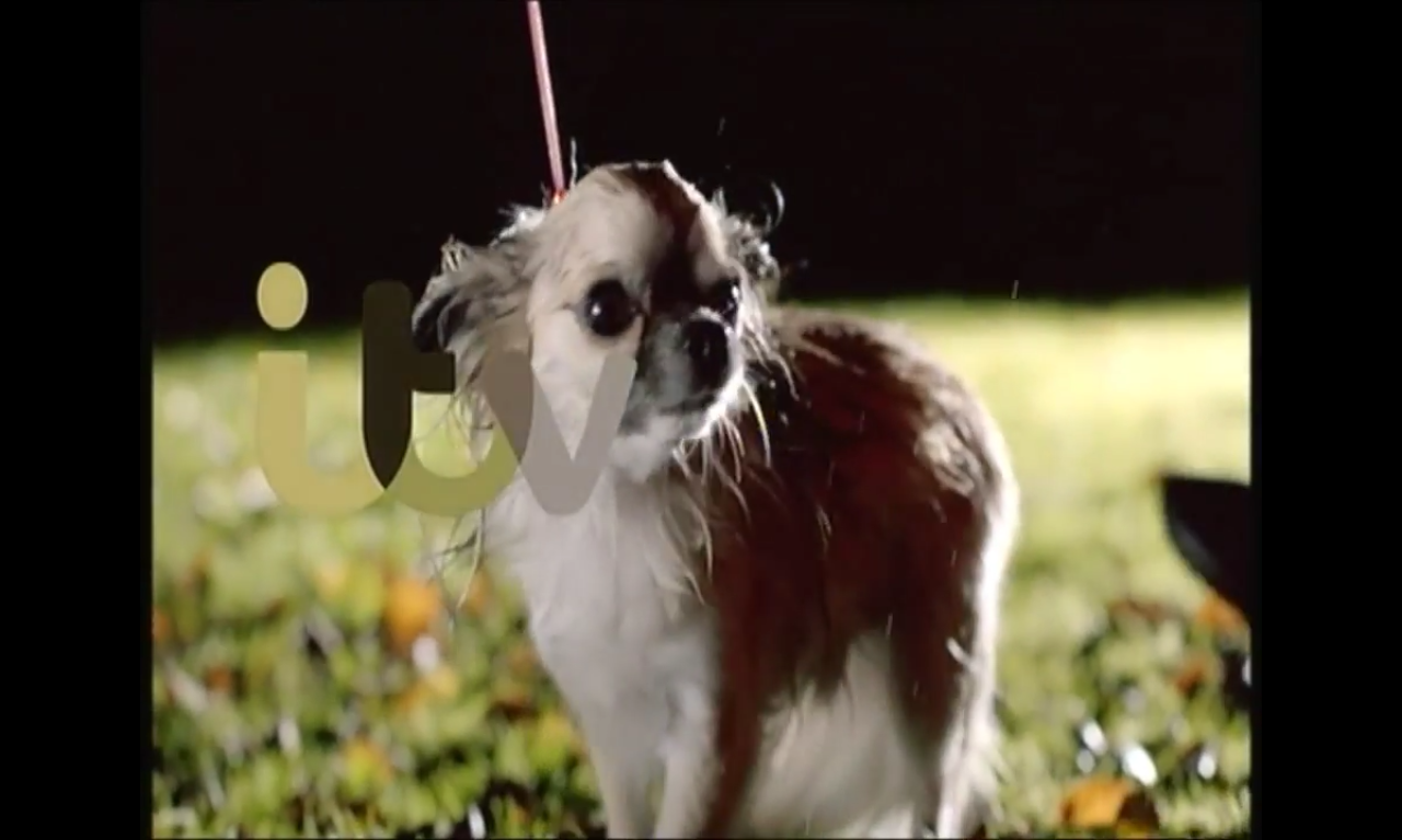
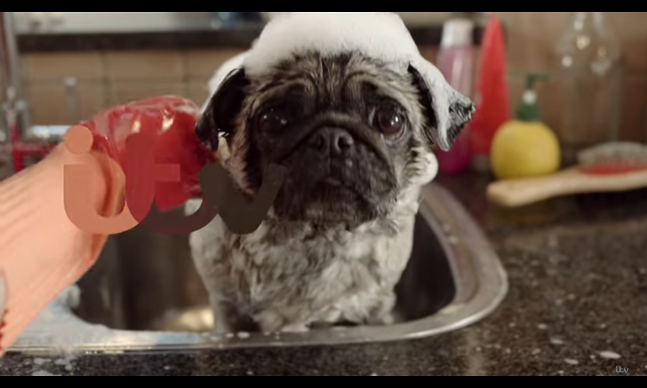
We used a specific editing technique throughout the documentary, we used this technique because we had seen it in most of the documentaries we had watched. It's using the audio of the interview over other clips we add in, we put them in to be relevant to what the person is saying, e.g. when Sarah talks about feeding the dogs correctly we have inserted archive footage of dogs eating, or when Liza talks about older dogs or puppies, we inserted clips of those specific ages of dogs. This technique is effective because it keeps the audience interested, as if it was just the interviewee, the viewer would lose interest and get bored, but if different clip pop up it gives them something to look at and also can help them understand because the clips will be relevant to what they are talking about. The last clip of our whole documentary that we edited in is the ident from ITV themselves, they make multiple different ones to have at the end of shows or sometimes between adverts, these are usually silent. There are two that we found from ITV, rather than ITV 2 etc., one has a chihuahua shaking off water and then being dried whilst the ITV logo appears, the other is of a pug being washed in a sink looking at the camera, we preferred the pug as the other was quite dark and the pug ident was well lit.
This is our first draft of the documentary. All editing was done on iMovie.
4/4/2017 0 Comments Double page spread - 1st draftWe updated our double page spread template to look more modern and appropriate for our documentary, we liked the idea of using a photo for the whole background of one of our pages and putting the text on an emptier part of it allowing the audience to see the writing better.  The left side of the double page spread
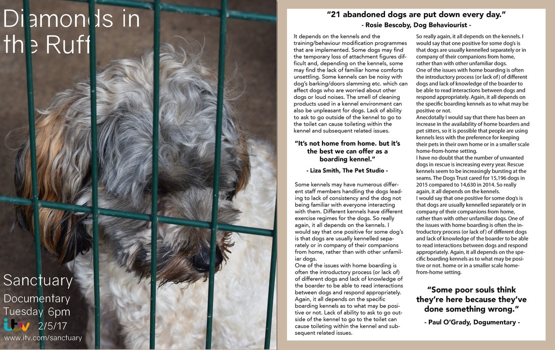
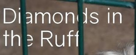
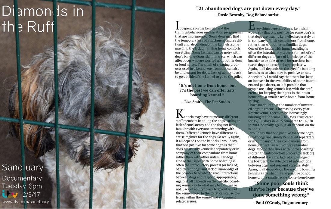
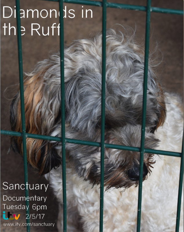
The tagline is finalised as 'Diamonds in the Ruff', we wanted a simple font that would stand out and not be too aggressive yet not too swirly, we found a font called 'Gravity' on dafont.com which was suitable for what we were looking for. We didn't want it to be put over the top of the photo and leave it with minimal photoshop skill used, so we experimented with different ways to present it, we then thought of keeping the bars of the kennel over the top of the letters to make it appear as though they are caged as well. I think this has worked well and gives an interesting effect to the page, we ensured we placed in carefully and in the right place as we didn't want the writing to overlap onto the dog's fur so I added them on individually giving me more control.
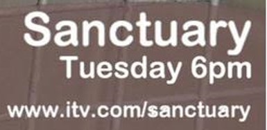
For the whole DPS, we used the left for the tagline, photograph, and channel information, we were able to put the writing over the photograph like we did because it had good empty space behind the subject of the photograph (Finley) allowing the writing to still be read without it looking too busy. The channel information that we put on was using the same font as the title, Gravity from dafont.com, this font was good to use because it is still easy to read even when it is smaller and combines the whole page together. What we wrote for this section is: Sanctuary Documentary Tuesday 6pm ITV 2/5/17 www.itv.com/sanctuary
 The right side of the double page spreadThe right side of the double page spread is where we put the writing, we copied the interview questions answers the dog behaviourist (Rosie Bescoby) sent us, this makes sure the writing is relevant to the documentary even though it may of been repeated. When we put all the writing on the page with the white background we thought that it seemed too blank and empty, so we decided to add a border for that page, I used the eye dropper tool to find a nice beige from the fur of Finley, we didn't want a shade that was too dark, and not too light that it couldn't be seen, when I found the right shade I created a border and put it around the writing. The drop quotes we used are actual quotes we have found or been given within our documentary, one is from Rosie Bescoby (dog behaviourist) which is in the introduction of the documentary, one is from Liza Smith (The Pet Studio) which we quoted her from the interview, and one is from Paul O'Grady in his documentary For the Love of Dogs, these quotes are real and not made up which I think makes the dps seem more professional. We wanted them to stand out from the rest of the writing on the page, so we made the font for them all slightly bigger and put it in bold, we also put the name of the person we got the quote from underneath. We considered putting them in a different colour, but we didn't want it to be too busy with colour as the border was there. As for the columns of writing themselves, we originally put them in as block paragraphs and this just looked too cramped, so we added in the paragraphs to break it up a bit and make it easier for audiences to follow/read.  We thought that the border for the right page could be more related to the left page, because some people may not see the resemblance between the colour of the border and Finley's fur, so I experimented and made it the same colour as the bars, this could allow the border to represent bars around the page. Although this will join the two pages together more than before, we aren't sure if it is too much green. 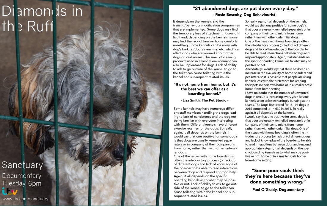 All editing was done on Photoshop.
4/3/2017 0 Comments Poster advert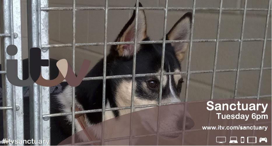  This poster was made on Photoshop, we studied other ITV posters to get an idea of the technique used to make them, the logo colours is what joins the poster together the most. I used the eye dropper tool to get some colours going across the photograph, so the silver from the bars, black from the dog's fur, tan brown from the dog's collar, cream from the dog's fur again and dusty pink from the inside of the dog's ear. Placing the logo needed to be on the left of the photograph from looking at previous poster's, if the subject of the photograph was on the left we would've needed to flip the photo giving us empty space, luckily, the subject was on the right side. We also needed it to be about in the centre of the left, we also had to look out to make sure the colour of each letter wasn't on a part of the photo we got it's colour from otherwise we wouldn't be able to see the letter. The 't' is close to the black of the fur, however, we noticed this and moved it enough to the left that is didn't blend together giving a weird effect. The big coloured curve going over the majority of the bottom of the poster is very iconic to ITV, to make it I got a circle on Photoshop and moved it until the right amount was showing, we decided the last colour of the logo was the nicest/best to use to be visible and not too dark, I then dropped the opacity down to about 50%. The font we used was not specifically made as in ITV font, but is very similar, I found it on Microsoft Word on a Mac computer, the rounded edges is what makes it a look alike, I used the same font for all the writing on the poster. On the poster I wrote: Sanctuary Tuesday 6pm www.itv.com/sanctuary This is relevant information for the documentary, including the 'website' makes it appear more official. On other ITV poster we studied, they all have a series of icons of different gadgets; a TV, a laptop, a phone, a tablet and a games console controller, I think it is showing ITV's platforms of which people can view their shows.
 On genuine ITV posters, some use a hashtag of the show, film or documentary to spread the word over social media, we thought we could add one in the bottom left corner which would fill an empty space and give it a bit more authenticity. We just used the hashtag #itvsanctuary, this would allow people to know the channel and name of the documentary if it got spoken about.
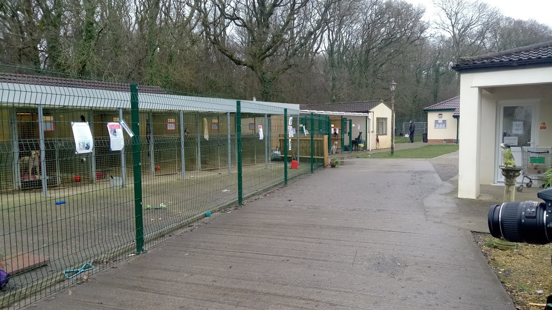
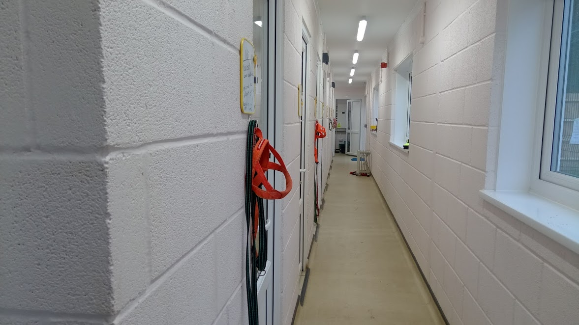
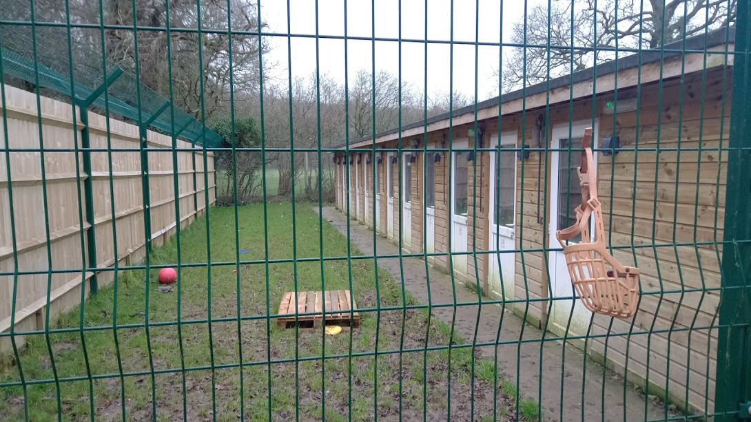
All editing was done on Photoshop. 3/13/2017 0 Comments Double page spread templatesThese are our templates for the double page spread. We had to return to Holly Hedge Animal Sanctuary to re-take some of the shots of the dogs there, we did not need to re-shoot the interview with Sarah. We had some quite shaky footage which wouldn't of looked very professional when edited into our documentary, we were successful in our trip back getting better shots than before with better quality, this is mainly due to the improved weather conditions giving more light. We also filmed the sign at the entrance to include in our documentary so establish where we are (establishing shot).
2/28/2017 0 Comments Itv postersI wanted to expand the amount of itv posters we had as that is the channel we have chosen, I used colours from throughout the photos to add to the itv logo which helps it blend with the photos without clashing or standing out too much. We used all of our own photographs from our visits to Holly Hedge and The Pet Studio.
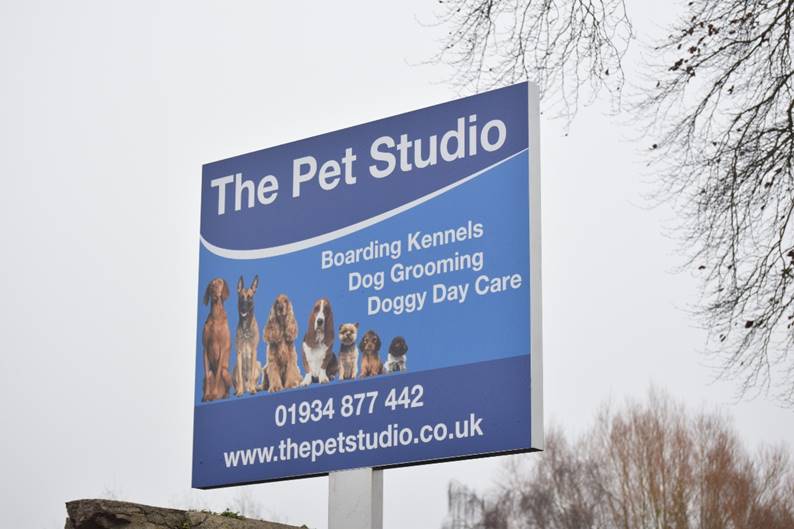
2/20/2017 0 Comments 20/02/2017 | The Pet StudioMonday. We went to The Pet Studio in Congresbury to film the second kennel facilities for our documentary. We interviewed Liza Smith, owner of Pet Studio, we slightly changed the questions we asked Sarah from Holly Hedge to ask Liza, this is so we could find out how the answers would vary from different industries, a rescue centre and a boarding kennel.
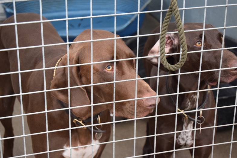
At The Pet Studio, staff members were interacting with the dogs making it become a more friendly and social boarding kennel, we were able to get footage of Liza walking two of the dogs staying there as use in a small clip in our documentary. We used the same camera that we used at Holly Hedge, Nikon D3300 with lens 18-55mm and 55-300mm. 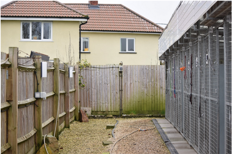 Saturday. We went to Holly Hedge Animal Sanctuary for our documentary, we interviewed Sarah Schranz, the kennel manager, who we had previously e-mailed about the day. We asked her our questions we put together to cover our topic. We were then able to explore the facilities and kennels filming the footage we needed.
We used a Nikon D3300 camera with a 18-55mm lens. We were able to capture good shots of the dogs, however, we think we will need to make another trip for re-shoots due to the quality of some.
|