My documentary |
|
4/27/2017 0 Comments Double page spread - 2nd draft
For our double page spread, we changed a few things to improve it's professionalism. We only changed the right side of the double page spread as this would be where people would look at the most to read about our documentary. The main and most obvious thing we changed is the style of the page, I removed the border as this made it look quite unauthentic and tacky, I also changed the font to PT Serif on Photoshop which gave a legitimate look as the font we had before made it appear rushed. I also enlarged the first letter of each new paragraph, which is something that many newspapers and magazines do, then finally, we didn't want to leave the page blank with only writing as this would make any viewer uninterested, so I added a giant letter S, we chose this letter because it is the first letter of the title of our documentary, I ensured the top and bottom of the S was in line with the top and bottom of the small print and this fit it well in the centre of the page, we also chose the colour of the S specifically, I used the eyedropper tool to get the colour of the kennel bars and made it that colour to relate both the pages together, however, when changing the opacity so the writing underneath was still visible, we lost some of the depth of colour, although this isn't ideal, we still think it shows the right colour. We got inspiration for this new design from a magazine double page spread about a celebrity.
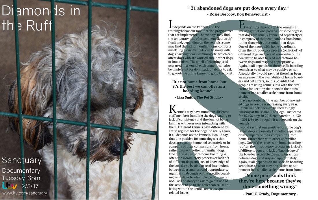 All editing was done on Photoshop.
0 Comments
Leave a Reply. |