My documentary |
|
4/4/2017 0 Comments Double page spread - 1st draftWe updated our double page spread template to look more modern and appropriate for our documentary, we liked the idea of using a photo for the whole background of one of our pages and putting the text on an emptier part of it allowing the audience to see the writing better.  The left side of the double page spread
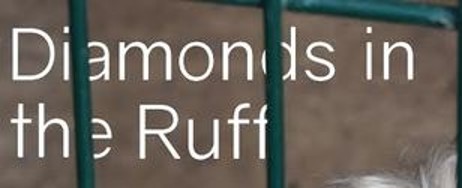
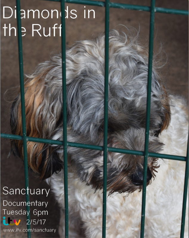
The tagline is finalised as 'Diamonds in the Ruff', we wanted a simple font that would stand out and not be too aggressive yet not too swirly, we found a font called 'Gravity' on dafont.com which was suitable for what we were looking for. We didn't want it to be put over the top of the photo and leave it with minimal photoshop skill used, so we experimented with different ways to present it, we then thought of keeping the bars of the kennel over the top of the letters to make it appear as though they are caged as well. I think this has worked well and gives an interesting effect to the page, we ensured we placed in carefully and in the right place as we didn't want the writing to overlap onto the dog's fur so I added them on individually giving me more control.
For the whole DPS, we used the left for the tagline, photograph, and channel information, we were able to put the writing over the photograph like we did because it had good empty space behind the subject of the photograph (Finley) allowing the writing to still be read without it looking too busy. The channel information that we put on was using the same font as the title, Gravity from dafont.com, this font was good to use because it is still easy to read even when it is smaller and combines the whole page together. What we wrote for this section is: Sanctuary Documentary Tuesday 6pm ITV 2/5/17 www.itv.com/sanctuary
 The right side of the double page spreadThe right side of the double page spread is where we put the writing, we copied the interview questions answers the dog behaviourist (Rosie Bescoby) sent us, this makes sure the writing is relevant to the documentary even though it may of been repeated. When we put all the writing on the page with the white background we thought that it seemed too blank and empty, so we decided to add a border for that page, I used the eye dropper tool to find a nice beige from the fur of Finley, we didn't want a shade that was too dark, and not too light that it couldn't be seen, when I found the right shade I created a border and put it around the writing. The drop quotes we used are actual quotes we have found or been given within our documentary, one is from Rosie Bescoby (dog behaviourist) which is in the introduction of the documentary, one is from Liza Smith (The Pet Studio) which we quoted her from the interview, and one is from Paul O'Grady in his documentary For the Love of Dogs, these quotes are real and not made up which I think makes the dps seem more professional. We wanted them to stand out from the rest of the writing on the page, so we made the font for them all slightly bigger and put it in bold, we also put the name of the person we got the quote from underneath. We considered putting them in a different colour, but we didn't want it to be too busy with colour as the border was there. As for the columns of writing themselves, we originally put them in as block paragraphs and this just looked too cramped, so we added in the paragraphs to break it up a bit and make it easier for audiences to follow/read. 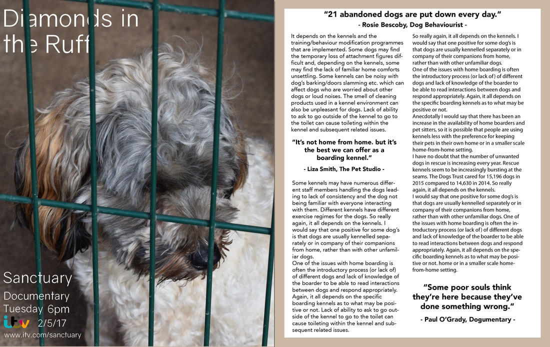 We thought that the border for the right page could be more related to the left page, because some people may not see the resemblance between the colour of the border and Finley's fur, so I experimented and made it the same colour as the bars, this could allow the border to represent bars around the page. Although this will join the two pages together more than before, we aren't sure if it is too much green. 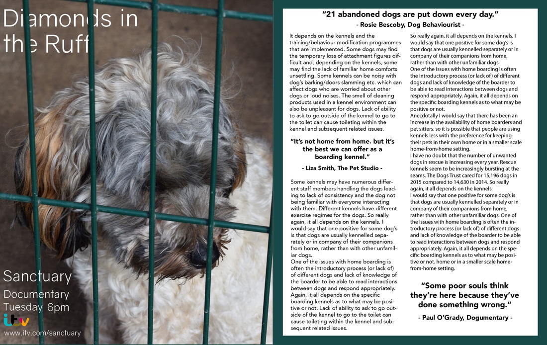 All editing was done on Photoshop.
0 Comments
Leave a Reply. |